Our 14G: a minimalist New York City studio apartment
I recently realized that I can no longer tell people I have been living in Los Angeles for "about 6 months." For some reason 6 months made me feel like I was still new here, fresh off the plane. But it has been 9 months, and pretty soon it will be a year! It's crazy to me how at home I feel here but also how new it all still seems. I still remember my commute to and from my lovely little apartment, the long waits for an elevator, and the casual conversations with our doormen like it was yesterday.
Probably needless to say (because if you've followed along for a while you know how neurotic I can be) but I panicked a little about our new home still having so many unfinished projects. This past weekend I decided to start honing in on them which led me down memory lane (aka my camera roll) looking for inspiration. Thats when I decided to put my numerous photos of our old place to use.
Our apartment was a ~525 square foot studio on the 14th floor of a high rise in Battery Park City. Despite having only one window in the entire apartment it was very light, and despite being a studio we had little issue with storage space. But that could have been a product of both my partner being pretty minimalist and strategic with our belongings.
Bedroom
I loved our bed "room" and never had an issue with not having a wall or door, even when we had guests for extended stays. I think I just appreciated how minimal it forced us to keep the space, and how open and airy it felt. We had a high bed frame (where suitcases could fit beneath) and a king sized mattress that probably wouldn't fit inside most 1 bedrooms in NYC. We each had matching side tables and side table lamps and a long dresser facing the bed. The dresser was actually 2 ikea pieces we each had before moving in together (thats why his is more yellow-ish than mine!), but we didn't really care and I kind of like the sentimentality of the two coming together in our first home together. Lastly, at some point we added a small armchair and runner to this area to warm it up and give us an extra seat to gaze out onto the river from.
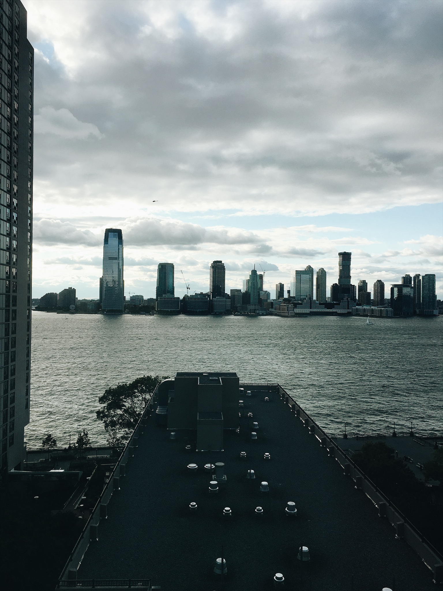
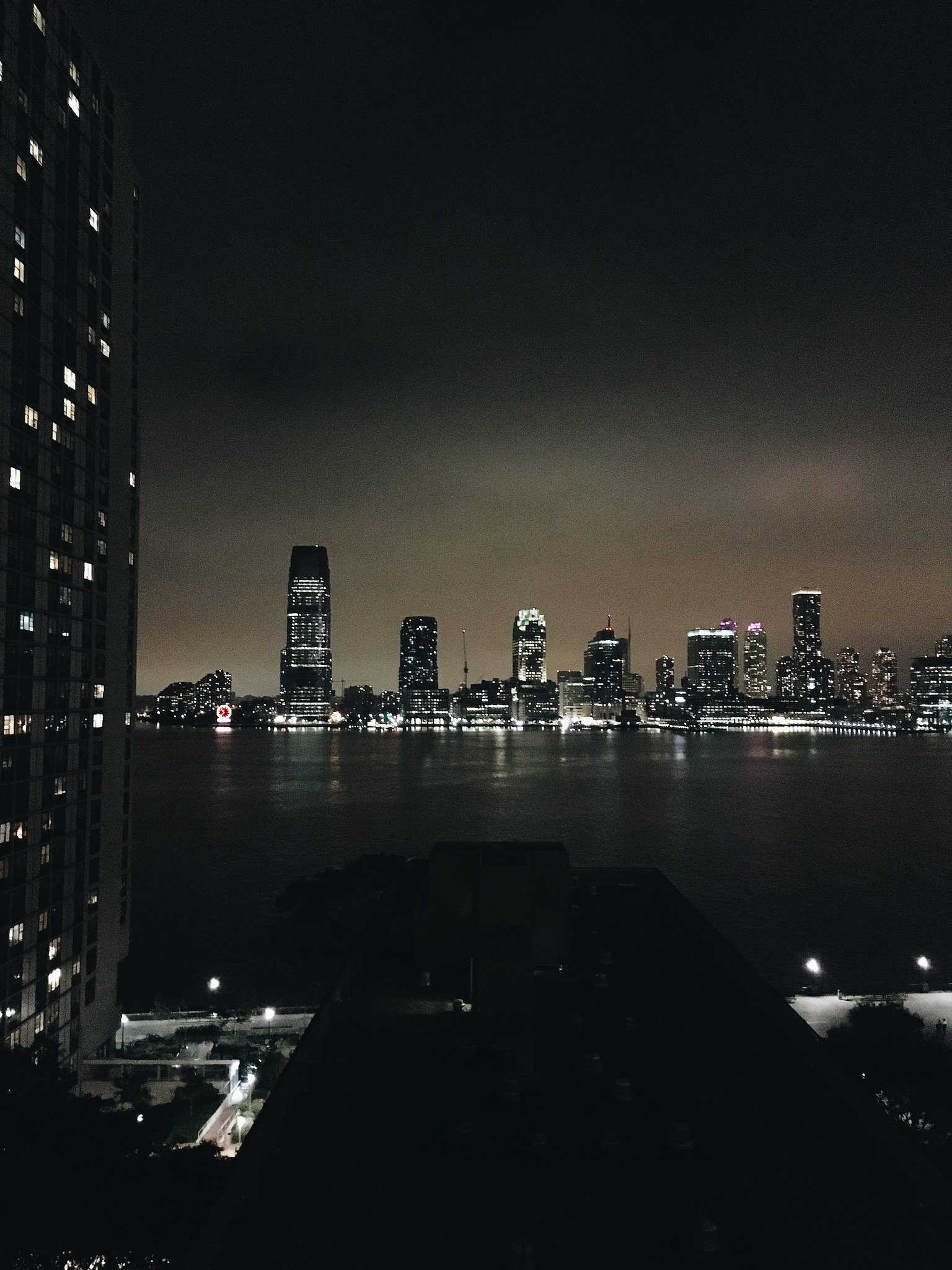
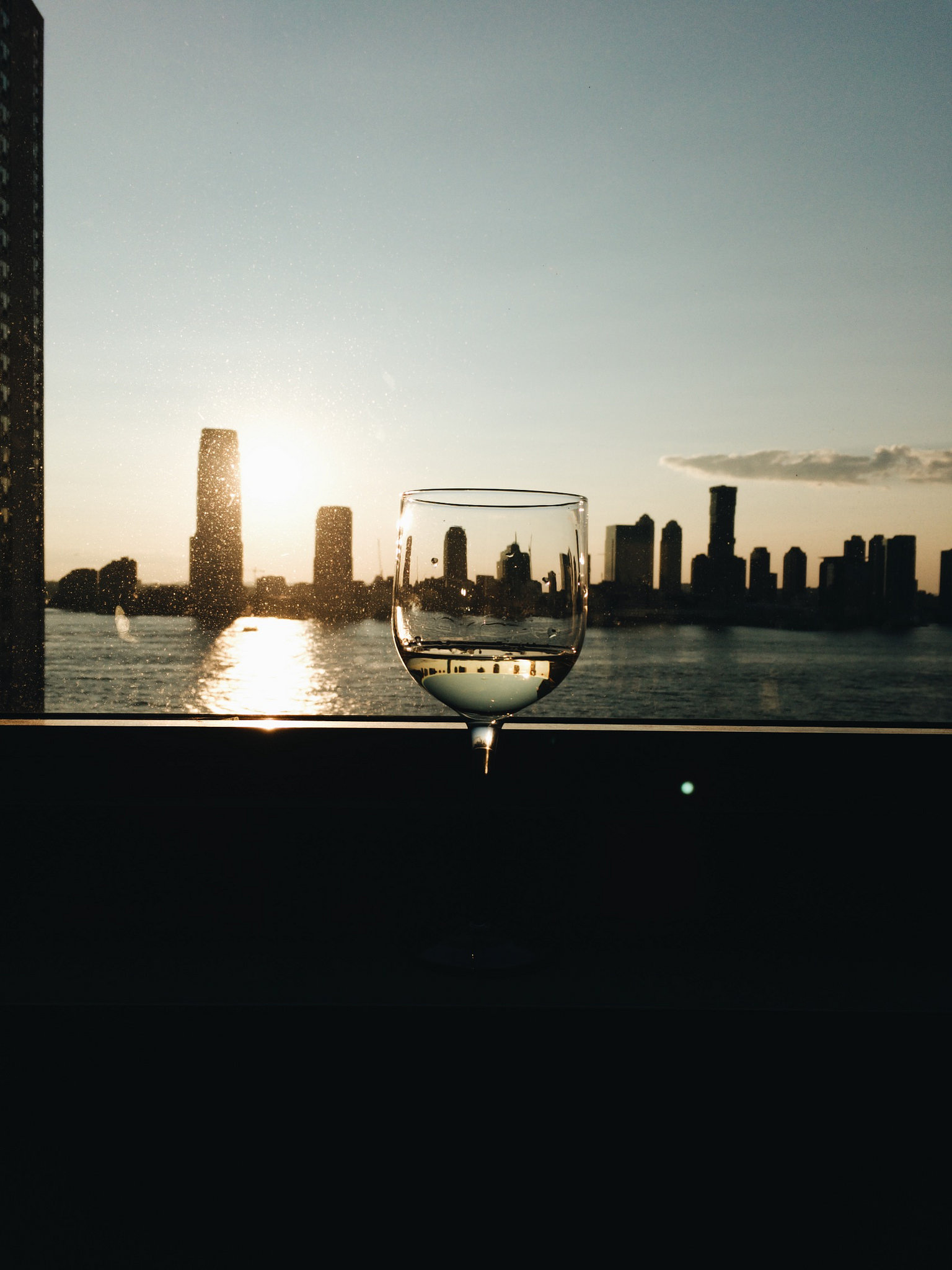
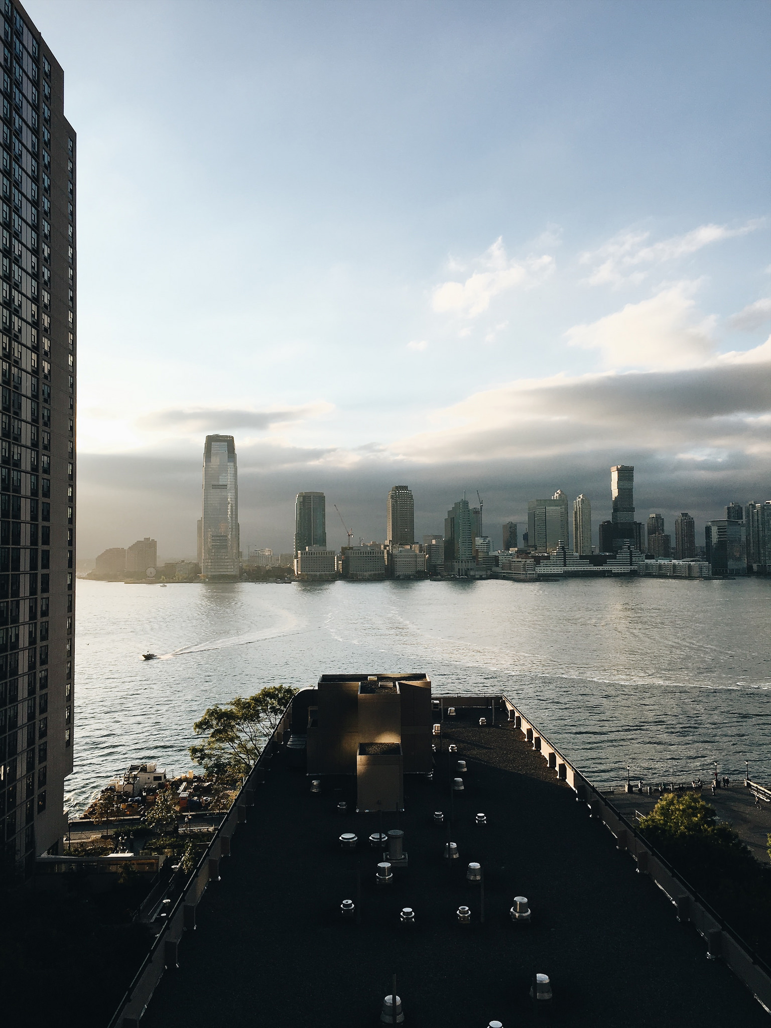
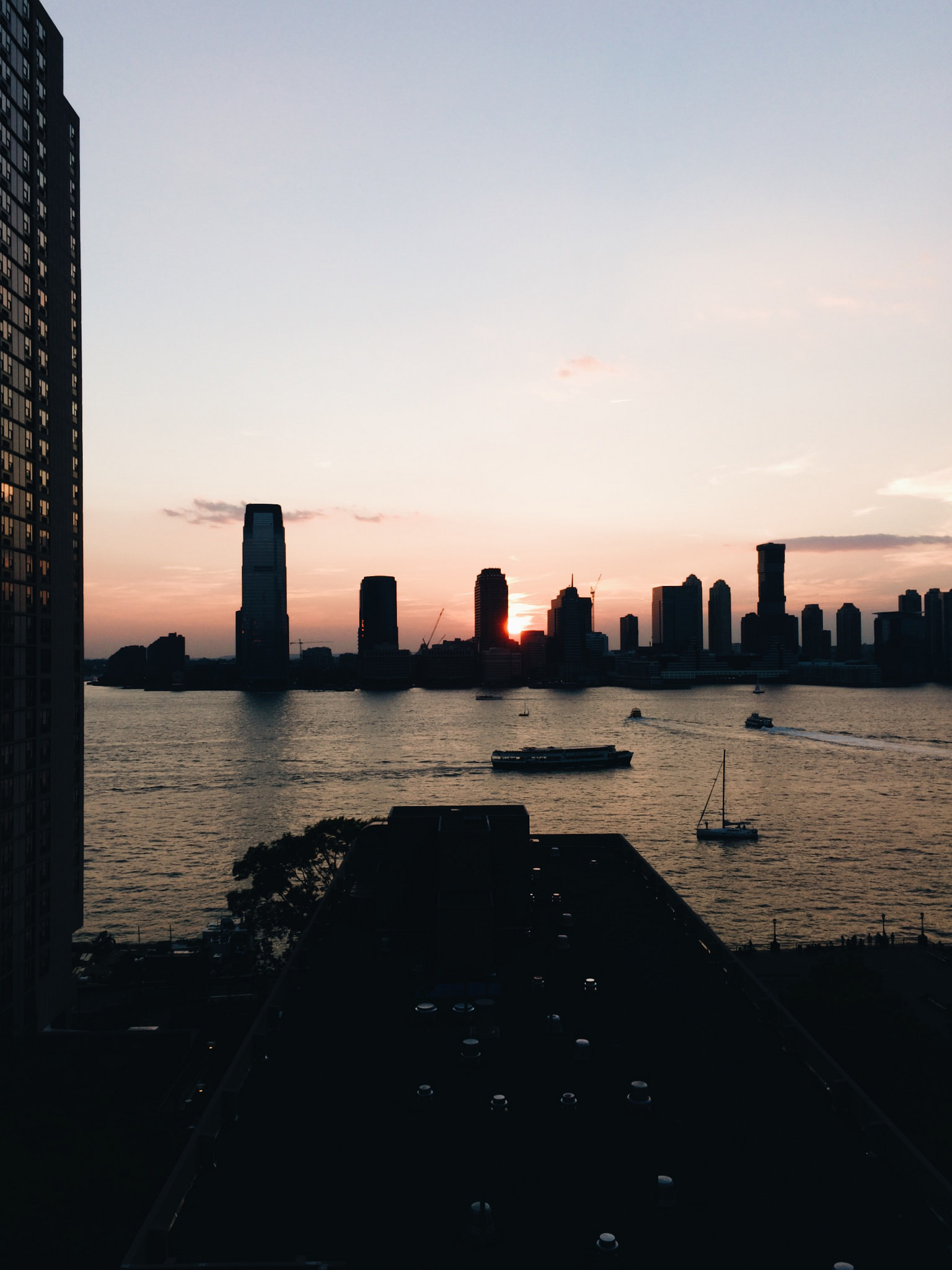
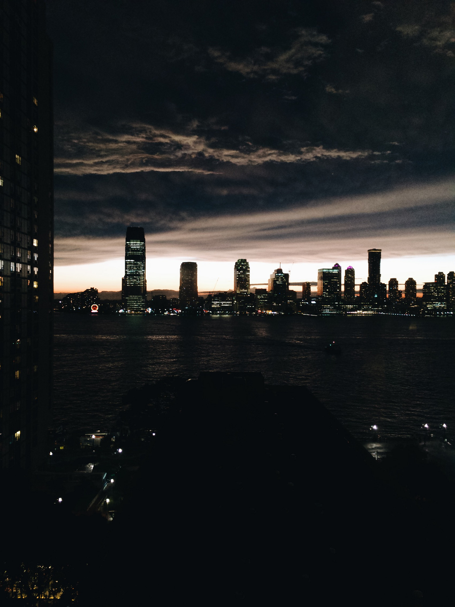
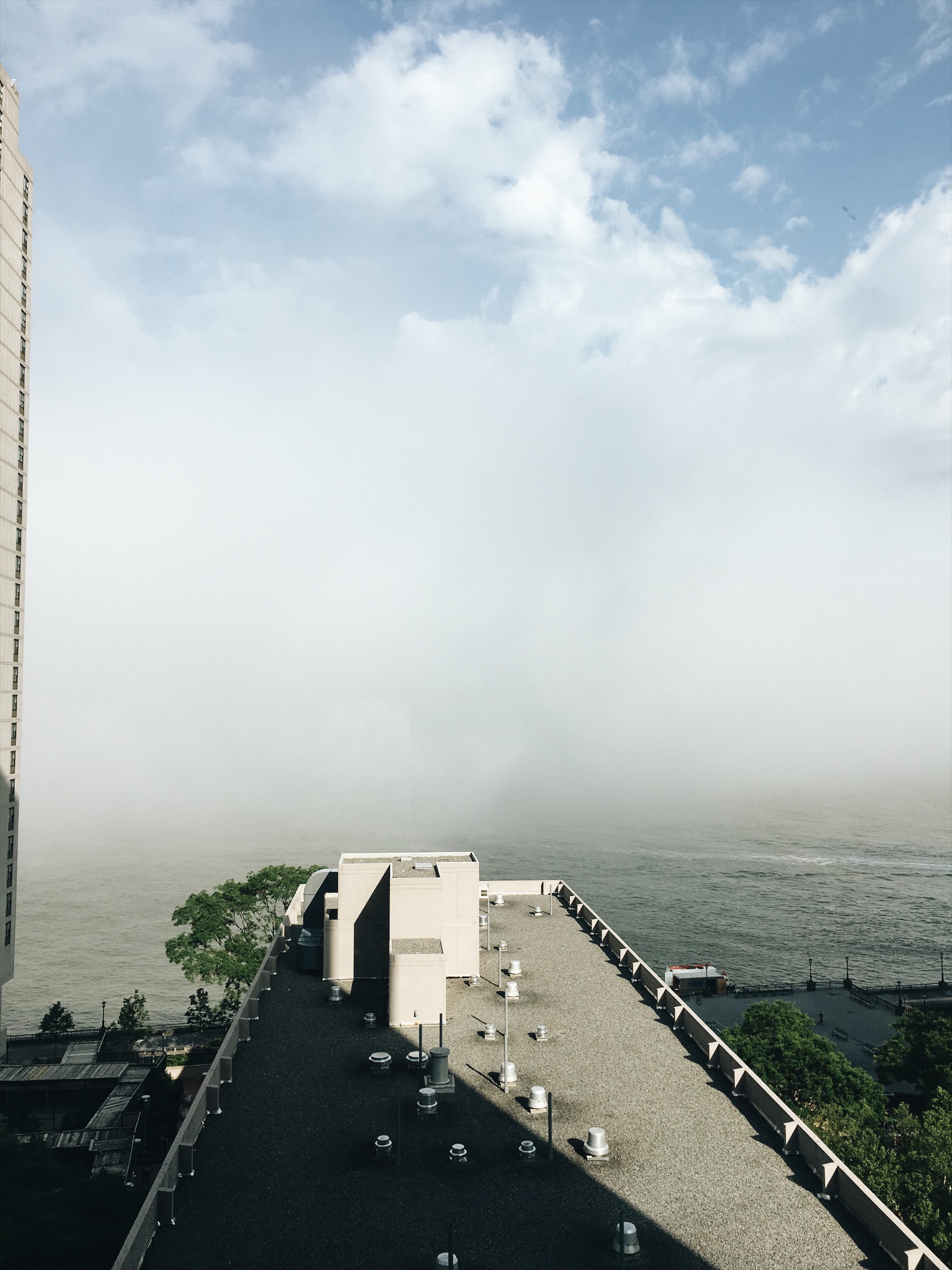
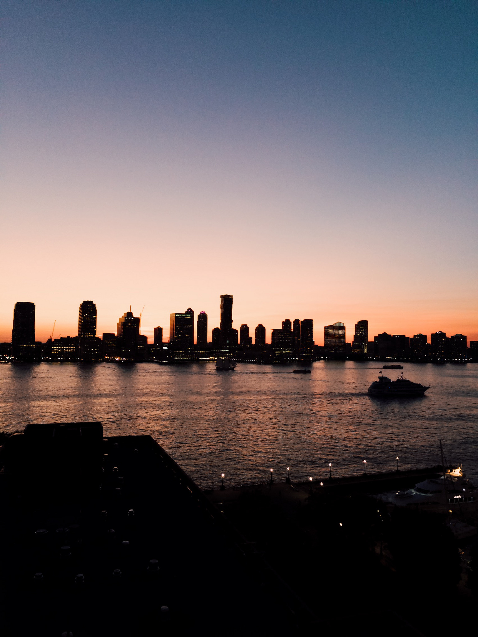
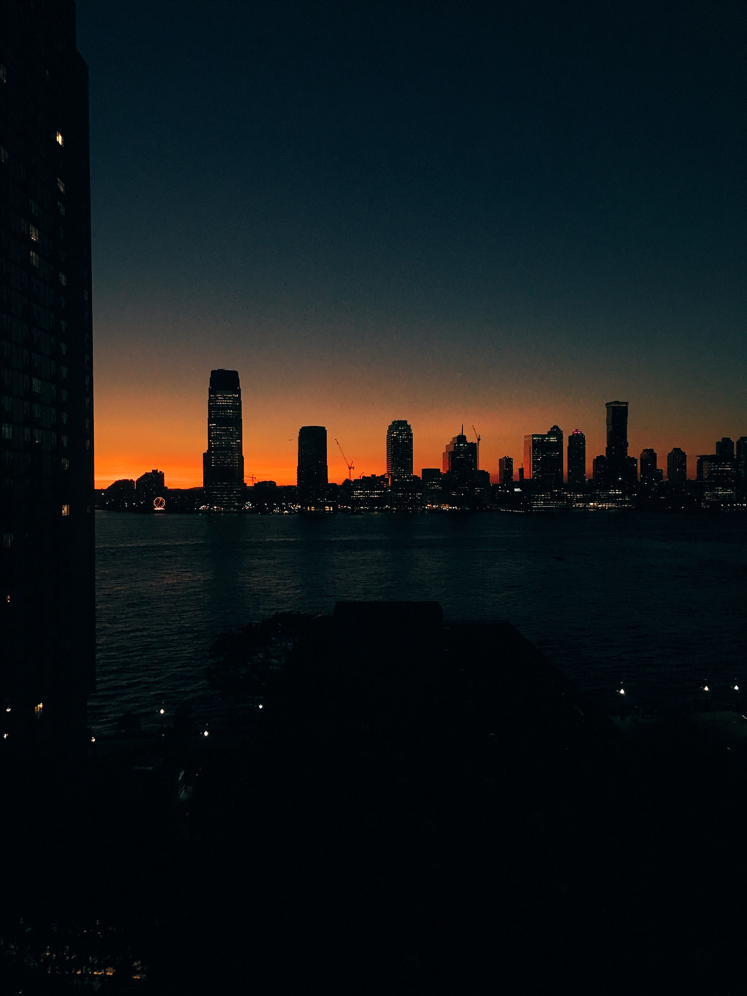
Undoubtedly the best part of this apartment was the view onto the Hudson. It's what sold us on this space and it created our refuge from the business of the city.
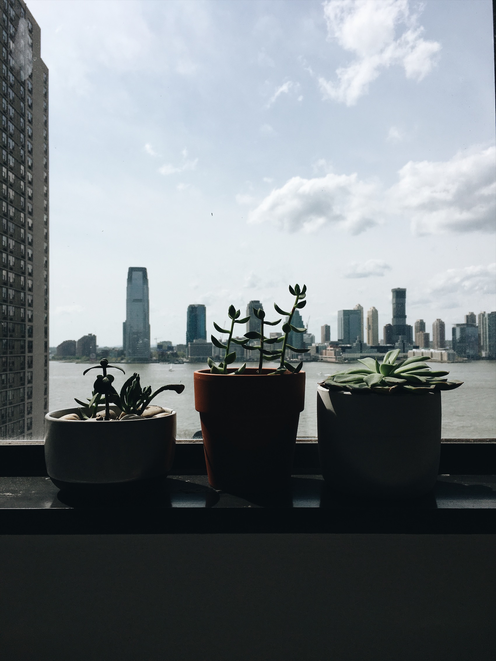
Our mostly white minimalist spot didn't need much more decoration than it's single large window. Just look at how much the view would change from day to day and day to night.
living space
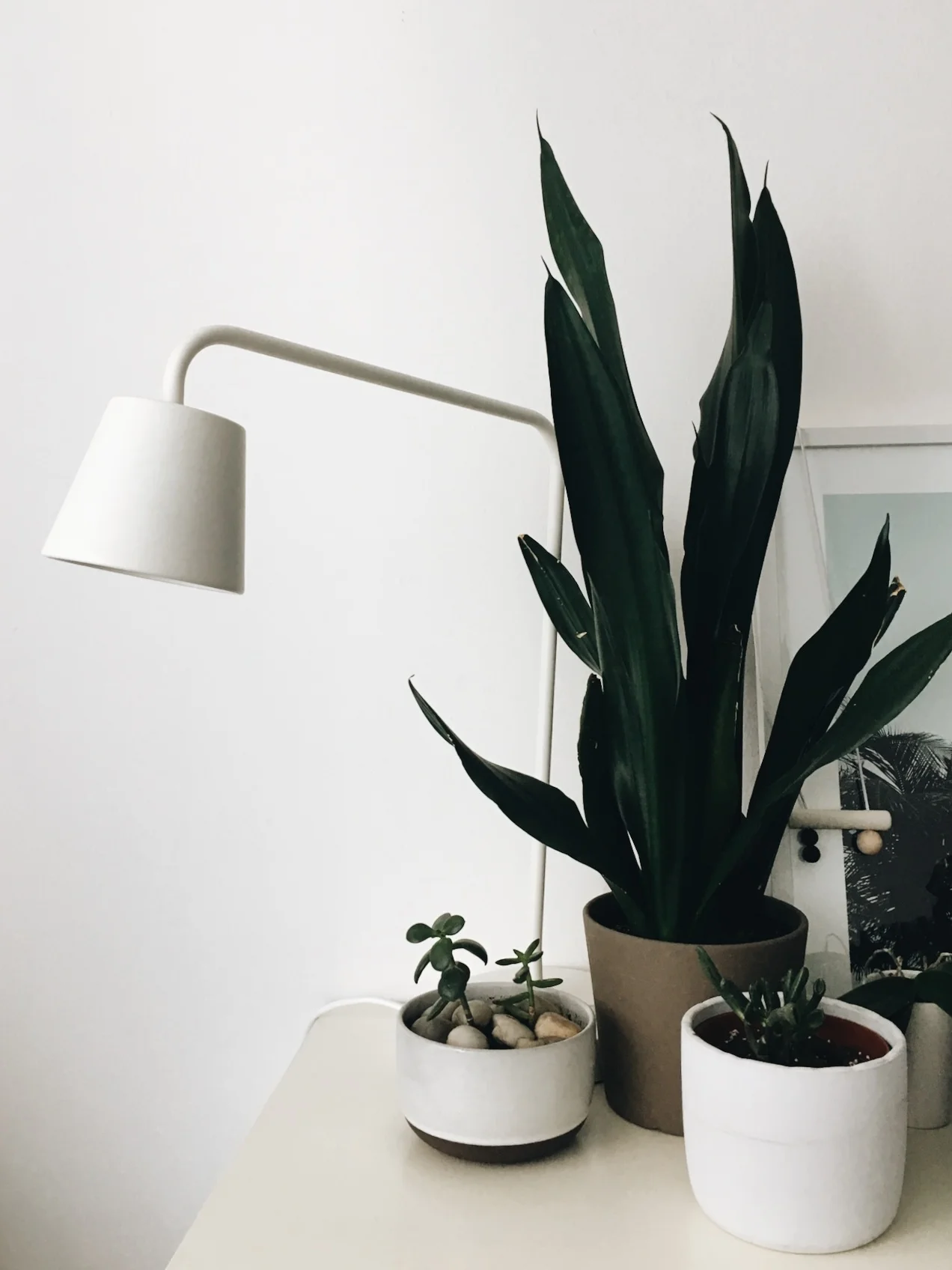
Our living space was where we worked, relaxed and entertained (yes we entertained!). Along one side of the room was out couch and oversized ottoman, separated from the bedroom by a low bookshelf and plants. On the opposite wall were our desks and desktop computers that also served as netflix players.
Above is a similar floor plan to ours, the kitchen and closets are slightly different, but you get the gist. Adjacent to our entry way and kitchen we kept a small cafe table that was rarely used for eating and more for serving and collecting mail. We mainly ate at the bar or (admittedly) on the couch. I also included a gratutious bathroom pic, I think I took this when we first toured the apartment which is why the sole decorative item which I was obsessed with is missing, a mudcloth print shower curtain from Target.
And with that this walk down memory lane comes to an end. So many sweet memories from this home, now off to continue nesting in our new one!


